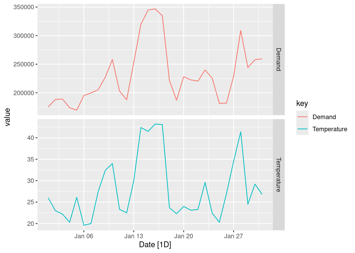
Half-hourly electricity demand for Victoria, Australia is contained in vic_elec. Extract the January 2014 electricity demand, and aggregate this data to daily with daily total demands and maximum temperatures.
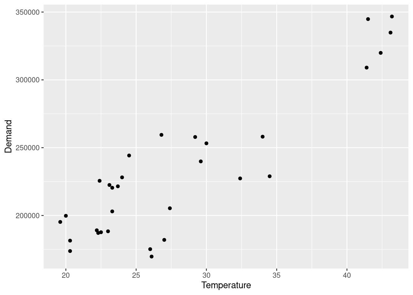
jan_vic_elec |>ggplot(aes(x = Temperature, y = Demand)) +geom_point()
fit <- jan_vic_elec |>model(TSLM(Demand ~ Temperature))fit |>report()
Series: Demand
Model: TSLM

Residuals:
     Min       1Q   Median       3Q      Max
-49978.2 -10218.9   -121.3  18533.2  35440.6

Coefficients:
            Estimate Std. Error t value Pr(>|t|)
(Intercept)  59083.9    17424.8   3.391  0.00203 **
Temperature   6154.3      601.3  10.235 3.89e-11 ***
---
Signif. codes:  0 '***' 0.001 '**' 0.01 '*' 0.05 '.' 0.1 ' ' 1

Residual standard error: 24540 on 29 degrees of freedom
Multiple R-squared: 0.7832, Adjusted R-squared: 0.7757
F-statistic: 104.7 on 1 and 29 DF, p-value: 3.8897e-11
It is clear that a positive relationship exists for this data. It is largely driven by days with high temperatures, that is resulting in more electricity being demanded (presumably to keep things cool).
Produce a residual plot. Is the model adequate? Are there any outliers or influential observations?
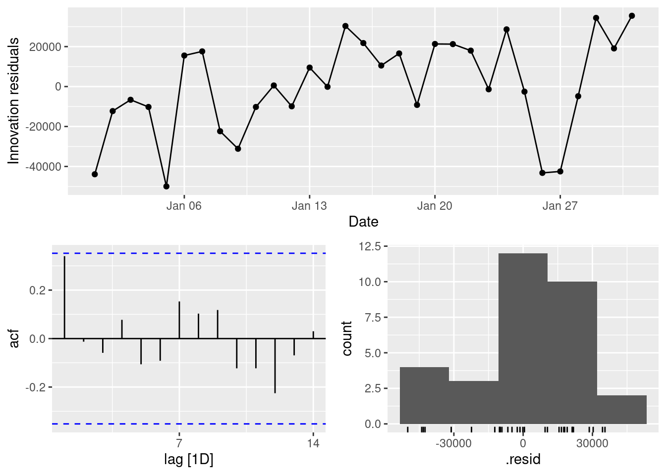
fit |>gg_tsresiduals()
The residuals from this section of the data suggest that the model is lacking a trend (although looking at a larger window of the data, this is clearly not a real pattern). Some large variability suggests that there are some outliers in this data.
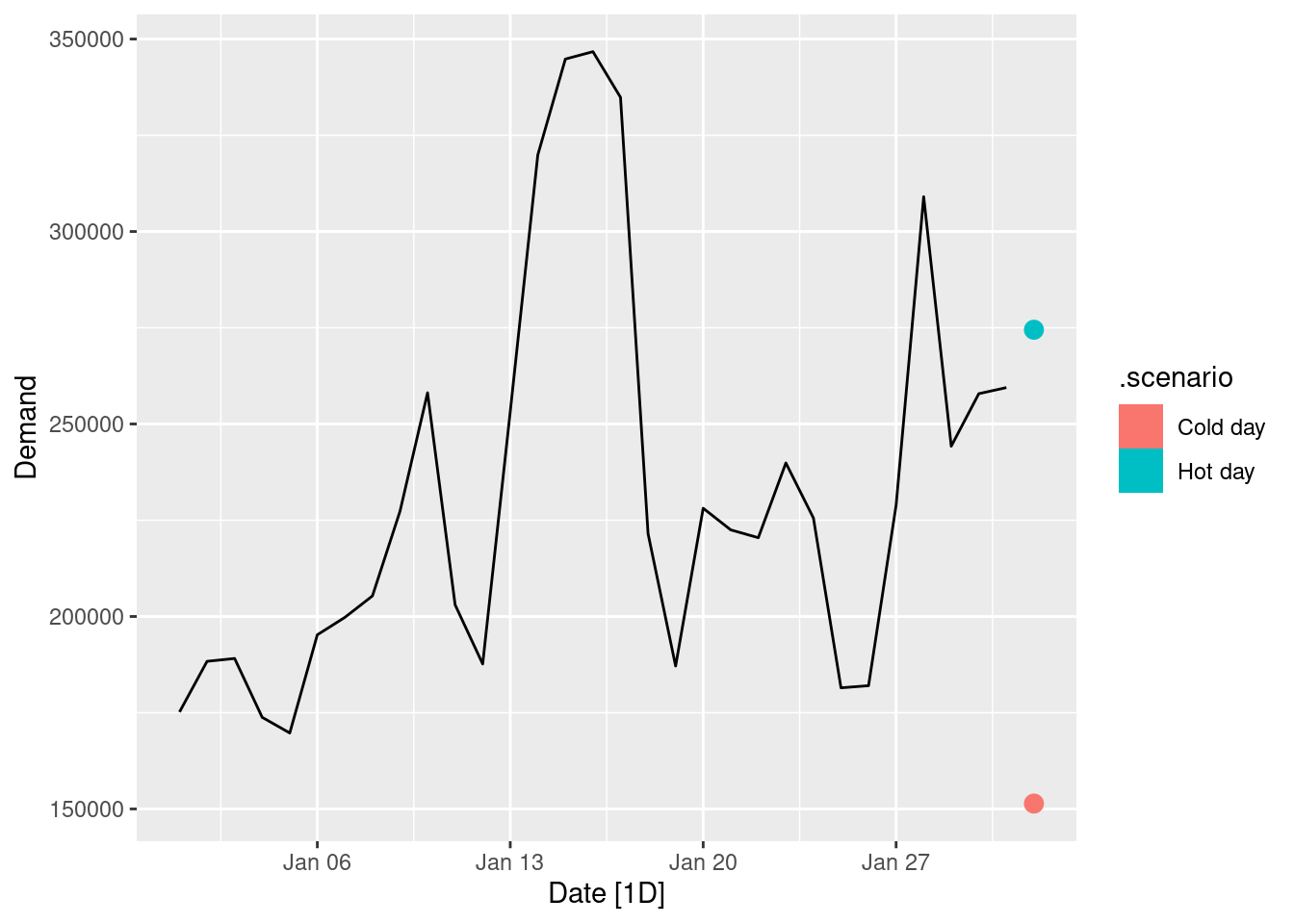
Use the model to forecast the electricity demand that you would expect for the next day if the maximum temperature was 15^\circ\text{C} and compare it with the forecast if the with maximum temperature was 35^\circ\text{C}. Do you believe these forecasts?
The forecasts seem reasonable. However we should be aware that there is not much data to support the forecasts at these temperature extremes, especially in that no daily maximum below 20^\circ\text{C} is observed during January (a summer month in Victoria).
Give prediction intervals for your forecasts.
fc |>hilo() |>select(-.model)
# A tsibble: 2 x 7 [1D]
# Key:       .scenario [2]
  .scenario Date
  <chr>     <date>
1 Cold day  2014-02-01
2 Hot day   2014-02-01
# ℹ 5 more variables: Demand <dist>, .mean <dbl>, Temperature <dbl>,
#   `80%` <hilo>, `95%` <hilo>
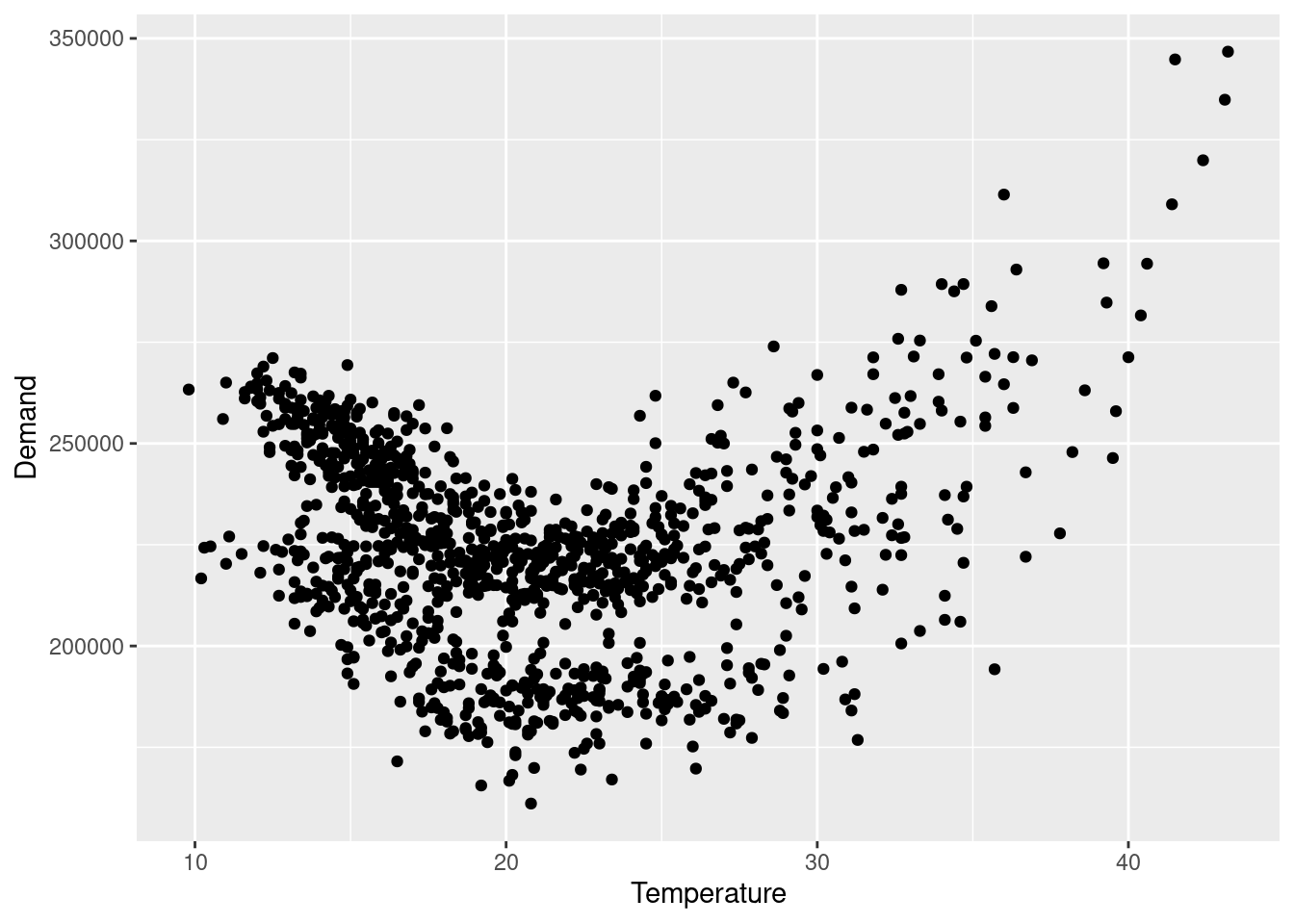
Plot Demand vs Temperature for all of the available data in vic_elec aggregated to daily total demand and maximum temperature. What does this say about your model?
vic_elec |>index_by(Date =as_date(Time)) |>summarise(Demand =sum(Demand), Temperature =max(Temperature)) |>ggplot(aes(x = Temperature, y = Demand)) +geom_point()
The “U” shaped scatterplot suggests that there is a non-linear relationship between electricity demand and daily maximum temperature. The model assumption that electricity demand is linearly predicted by temperature is incorrect.
fpp3 7.10, Ex 2
Data set olympic_running contains the winning times (in seconds) in each Olympic Games sprint, middle-distance and long-distance track events from 1896 to 2016.
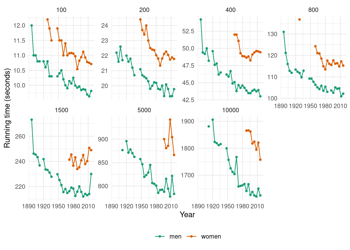
Plot the winning time against the year. Describe the main features of the plot.
olympic_running |>ggplot(aes(x = Year, y = Time, colour = Sex)) +geom_line() +geom_point(size =1) +facet_wrap(~Length, scales ="free_y", nrow =2) +theme_minimal() +scale_color_brewer(palette ="Dark2") +theme(legend.position ="bottom", legend.title =element_blank()) +labs(y ="Running time (seconds)")
The running times are generally decreasing as time progresses (although the rate of this decline is slowing down in recent olympics). There are some missing values in the data corresponding to the World Wars (in which the Olympic Games were not held).
Fit a regression line to the data. Obviously the winning times have been decreasing, but at what average rate per year?
fit <- olympic_running |>model(TSLM(Time ~trend()))tidy(fit)
# A tibble: 28 × 8
   Length Sex   .model               term  estimate std.error statistic  p.value
    <int> <chr> <chr>                <chr>    <dbl>     <dbl>     <dbl>    <dbl>
 1    100 men   TSLM(Time ~ trend()) (Int…  11.1      0.0909     123.   1.86e-37
 2    100 men   TSLM(Time ~ trend()) tren…  -0.0504   0.00479    -10.5  7.24e-11
 3    100 women TSLM(Time ~ trend()) (Int…  12.4      0.163       76.0  4.58e-25
 4    100 women TSLM(Time ~ trend()) tren…  -0.0567   0.00749     -7.58 3.72e- 7
 5    200 men   TSLM(Time ~ trend()) (Int…  22.3      0.140      159.   4.06e-39
 6    200 men   TSLM(Time ~ trend()) tren…  -0.0995   0.00725    -13.7  3.80e-13
 7    200 women TSLM(Time ~ trend()) (Int…  25.5      0.525       48.6  8.34e-19
 8    200 women TSLM(Time ~ trend()) tren…  -0.135    0.0227      -5.92 2.17e- 5
 9    400 men   TSLM(Time ~ trend()) (Int…  50.3      0.445      113.   1.53e-36
10    400 men   TSLM(Time ~ trend()) tren…  -0.258    0.0235     -11.0  2.75e-11
# ℹ 18 more rows
The men’s 100 running time has been decreasing by an average of 0.013 seconds each year. The women’s 100 running time has been decreasing by an average of 0.014 seconds each year. The men’s 200 running time has been decreasing by an average of 0.025 seconds each year. The women’s 200 running time has been decreasing by an average of 0.034 seconds each year. The men’s 400 running time has been decreasing by an average of 0.065 seconds each year. The women’s 400 running time has been decreasing by an average of 0.04 seconds each year. The men’s 800 running time has been decreasing by an average of 0.152 seconds each year. The women’s 800 running time has been decreasing by an average of 0.198 seconds each year. The men’s 1500 running time has been decreasing by an average of 0.315 seconds each year. The women’s 1500 running time has been increasing by an average of 0.147 seconds each year. The men’s 5000 running time has been decreasing by an average of 1.03 seconds each year. The women’s 5000 running time has been decreasing by an average of 0.303 seconds each year. The men’s 10000 running time has been decreasing by an average of 2.666 seconds each year. The women’s 10000 running time has been decreasing by an average of 3.496 seconds each year.
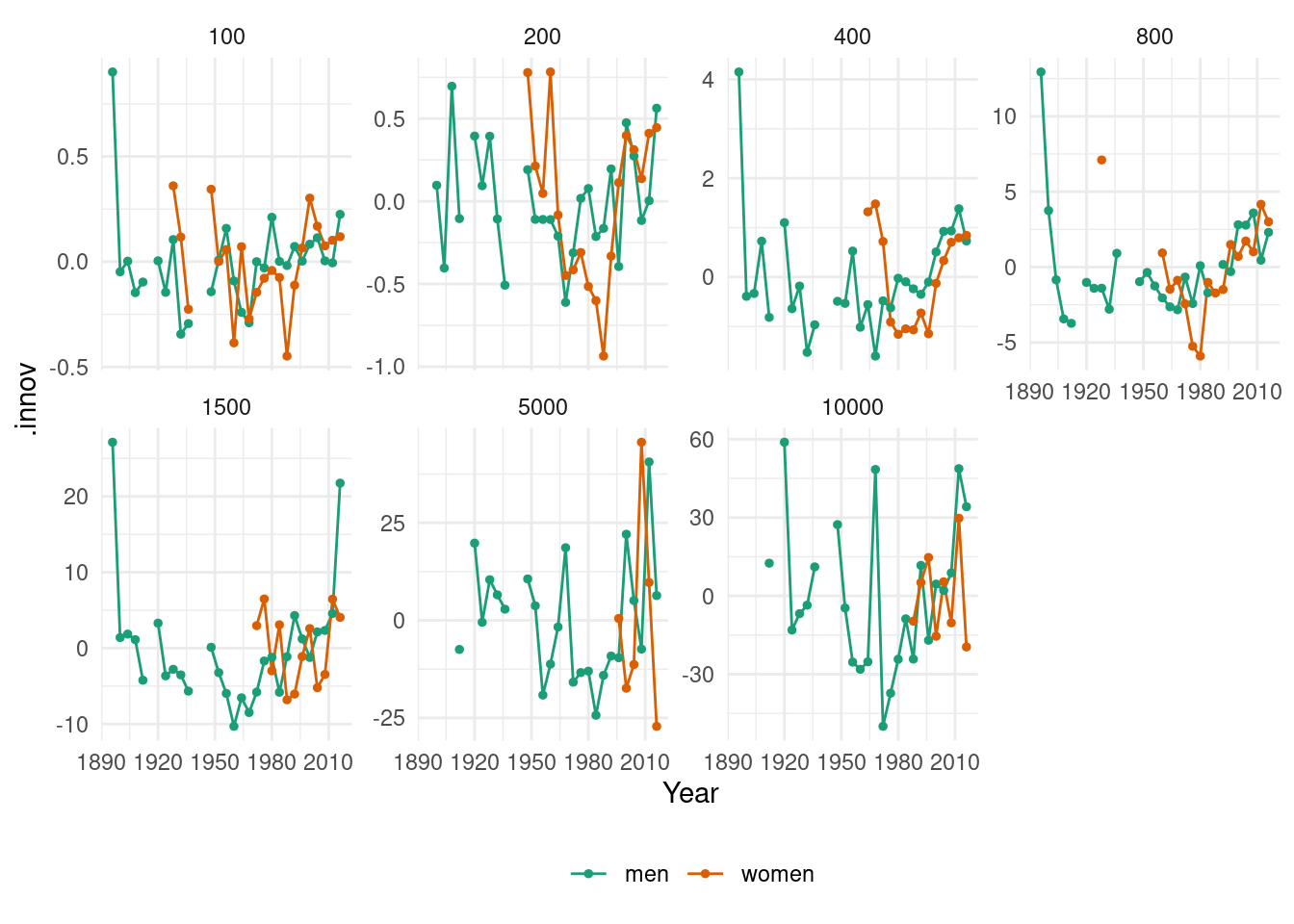
Plot the residuals against the year. What does this indicate about the suitability of the fitted line?
It doesn’t seem that the linear trend is appropriate for this data.
Predict the winning time for each race in the 2020 Olympics. Give a prediction interval for your forecasts. What assumptions have you made in these calculations?
fit |>forecast(h =1) |>mutate(PI =hilo(Time, 95)) |>select(-.model)
# A fable: 14 x 6 [4Y]
# Key:     Length, Sex [14]
   Length Sex    Year
    <int> <chr> <dbl>
 1    100 men    2020
 2    100 women  2020
 3    200 men    2020
 4    200 women  2020
 5    400 men    2020
 6    400 women  2020
 7    800 men    2020
 8    800 women  2020
 9   1500 men    2020
10   1500 women  2020
11   5000 men    2020
12   5000 women  2020
13  10000 men    2020
14  10000 women  2020
# ℹ 3 more variables: Time <dist>, .mean <dbl>, PI <hilo>
Using a linear trend we assume that winning times will decrease in a linear fashion which is unrealistic for running times. As we saw from the residual plots above there are mainly large positive residuals for the last few years, indicating that the decreases in the winning times are not linear. We also assume that the residuals are normally distributed.
fpp3 7.10, Ex3
An elasticity coefficient is the ratio of the percentage change in the forecast variable (y) to the percentage change in the predictor variable (x). Mathematically, the elasticity is defined as (dy/dx)\times(x/y). Consider the log-log model,
\log y=\beta_0+\beta_1 \log x + \varepsilon.
Express y as a function of x and show that the coefficient \beta_1 is the elasticity coefficient.
We will take conditional expectation of the left and the right parts of the equation: \mathrm{E}(\log(y)\mid x) = \mathrm{E}(\beta_0 + \beta_1 \log(x) + \varepsilon\mid x) = \beta_0 + \beta_1\log(x). By taking derivatives of the left and the right parts of the last equation we get: \frac{y'}{y} = \frac{\beta_1}{x}, and then \beta_1 = \frac{y' x}{y}. It is exactly what we need to prove, taking into account that y' = \frac{dy}{dx}.
fpp3 7.10, Ex 4
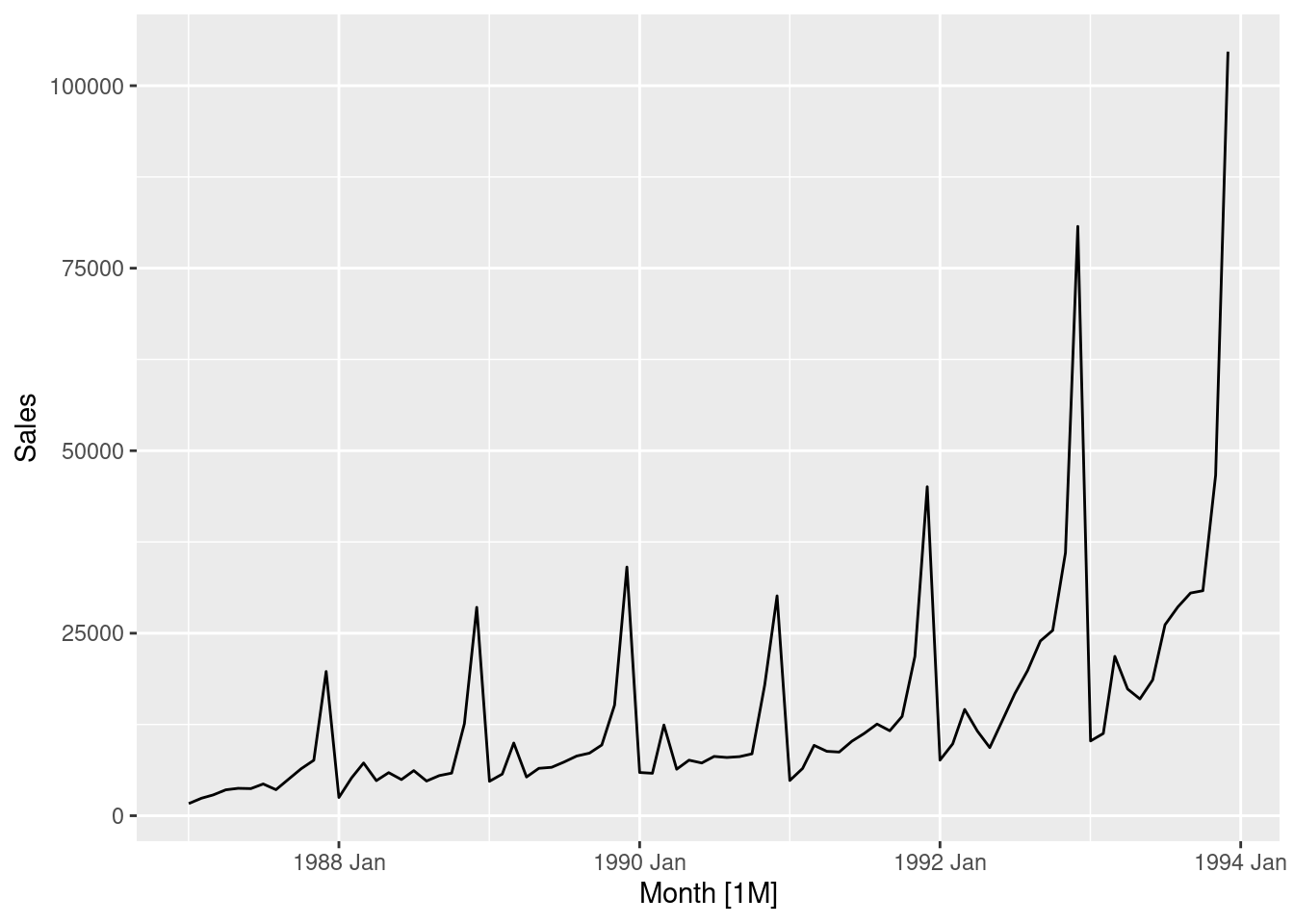
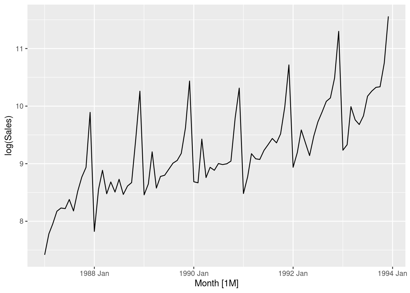
The data set souvenirs concerns the monthly sales figures of a shop which opened in January 1987 and sells gifts, souvenirs, and novelties. The shop is situated on the wharf at a beach resort town in Queensland, Australia. The sales volume varies with the seasonal population of tourists. There is a large influx of visitors to the town at Christmas and for the local surfing festival, held every March since 1988. Over time, the shop has expanded its premises, range of products, and staff.
Produce a time plot of the data and describe the patterns in the graph. Identify any unusual or unexpected fluctuations in the time series.
souvenirs |>autoplot(Sales)
Features of the data:
Seasonal data – similar scaled pattern repeats every year
A spike every March (except for year 1987) is the influence of the surfing festival
The size of the pattern increases proportionally to the level of sales
Explain why it is necessary to take logarithms of these data before fitting a model.
The last feature above suggests taking logs to make the pattern (and variance) more stable
# Taking logarithms of the datasouvenirs |>autoplot(log(Sales))
After taking logs, the trend looks more linear and the seasonal variation is roughly constant.
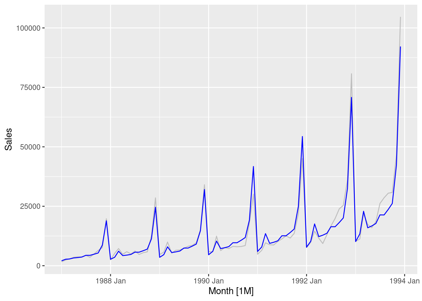
Fit a regression model to the logarithms of these sales data with a linear trend, seasonal dummies and a “surfing festival” dummy variable.
fit <- souvenirs |>mutate(festival =month(Month) ==3&year(Month) !=1987) |>model(reg =TSLM(log(Sales) ~trend() +season() + festival))souvenirs |>autoplot(Sales, col ="gray") +geom_line(data =augment(fit), aes(y = .fitted), col ="blue")
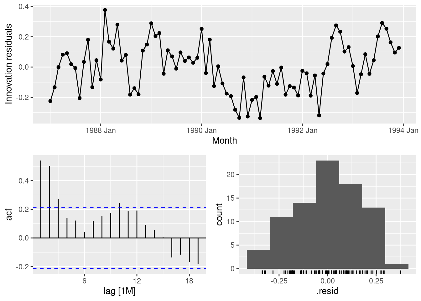
Plot the residuals against time and against the fitted values. Do these plots reveal any problems with the model?
fit |>gg_tsresiduals()
The residuals are serially correlated. This is both visible from the time plot but also from the ACF. The residuals reveal nonlinearity in the trend.
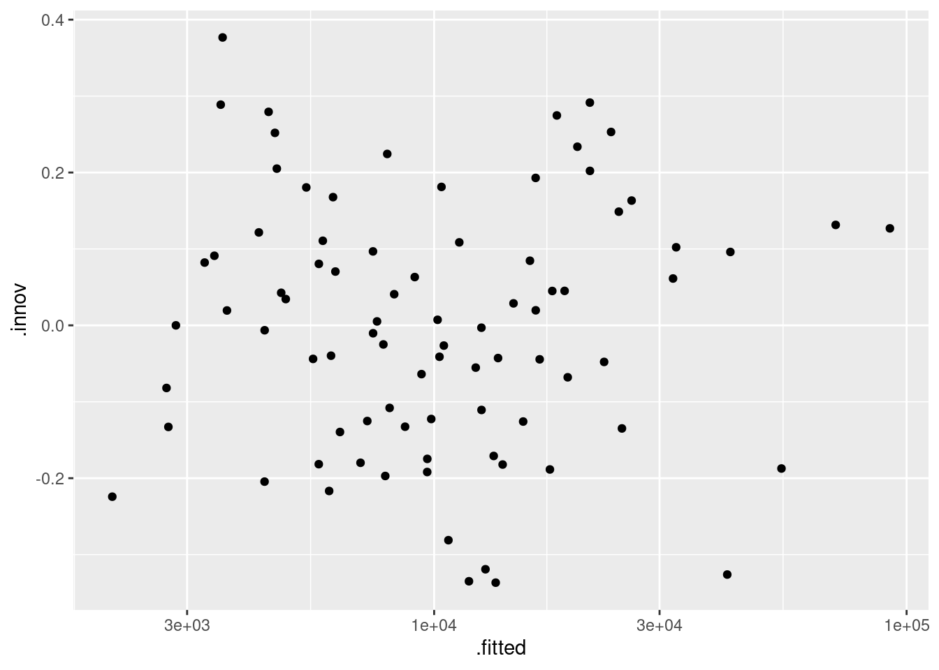
augment(fit) |>ggplot(aes(x = .fitted, y = .innov)) +geom_point() +scale_x_log10()
The plot of residuals against fitted values looks fine - no notable patterns emerge. We take logarithms of fitted values because we took logs in the model.
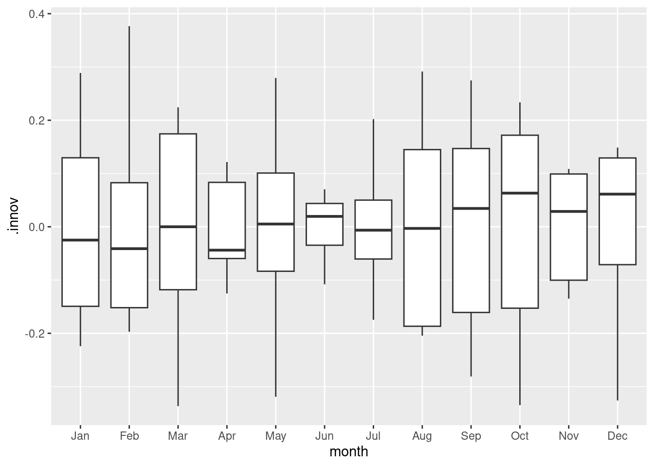
Do boxplots of the residuals for each month. Does this reveal any problems with the model?
trend coefficient shows that with every month sales increases on average by 2.2%.
season2 coefficient shows that February sales are greater than January on average by 28.6%, after allowing for the trend.
…
season12 coefficient shows that December sales are greater than January on average by 611.5%, after allowing for the trend.
festivalTRUE coefficient shows that for months that include the surfing festival, sales increases on average by 65.1% compared to months without the festival, after allowing for the trend and seasonality.
What does the Ljung-Box test tell you about your model?
augment(fit) |>features(.innov, ljung_box, lag =24)
The serial correlation in the residuals is significant.
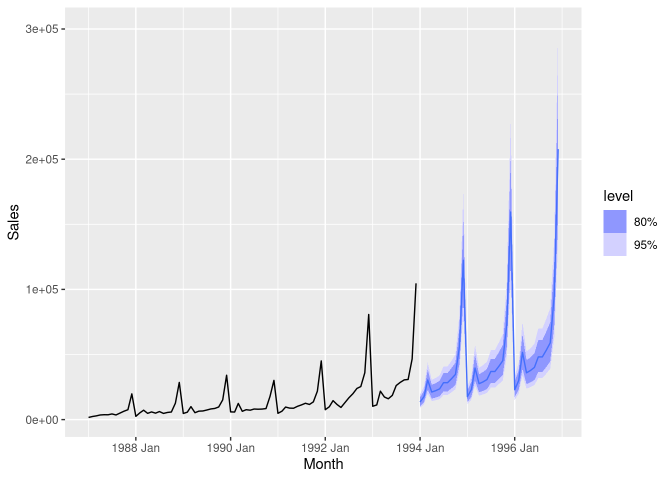
Regardless of your answers to the above questions, use your regression model to predict the monthly sales for 1994, 1995, and 1996. Produce prediction intervals for each of your forecasts.
How could you improve these predictions by modifying the model?
The model can be improved by taking into account nonlinearity of the trend.
fpp3 7.10, Ex 5
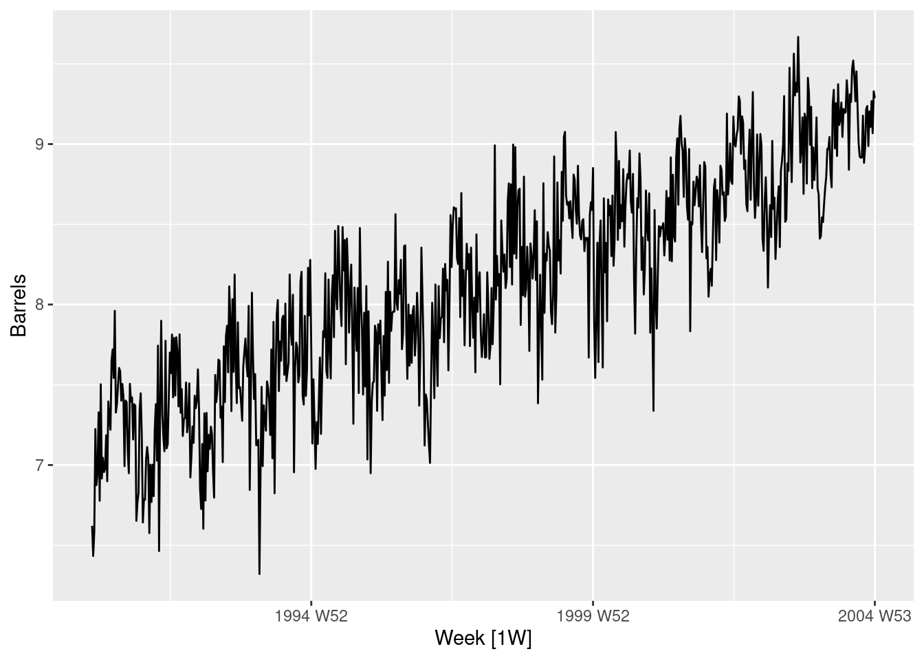
The us_gasoline series consists of weekly data for supplies of US finished motor gasoline product, from 2 February 1991 to 20 January 2017. The units are in “thousand barrels per day”. Consider only the data to the end of 2004. a. Fit a harmonic regression with trend to the data. Experiment with changing the number Fourier terms. Plot the observed gasoline and fitted values and comment on what you see.
gas <- us_gasoline |>filter(year(Week) <=2004)gas |>autoplot(Barrels)
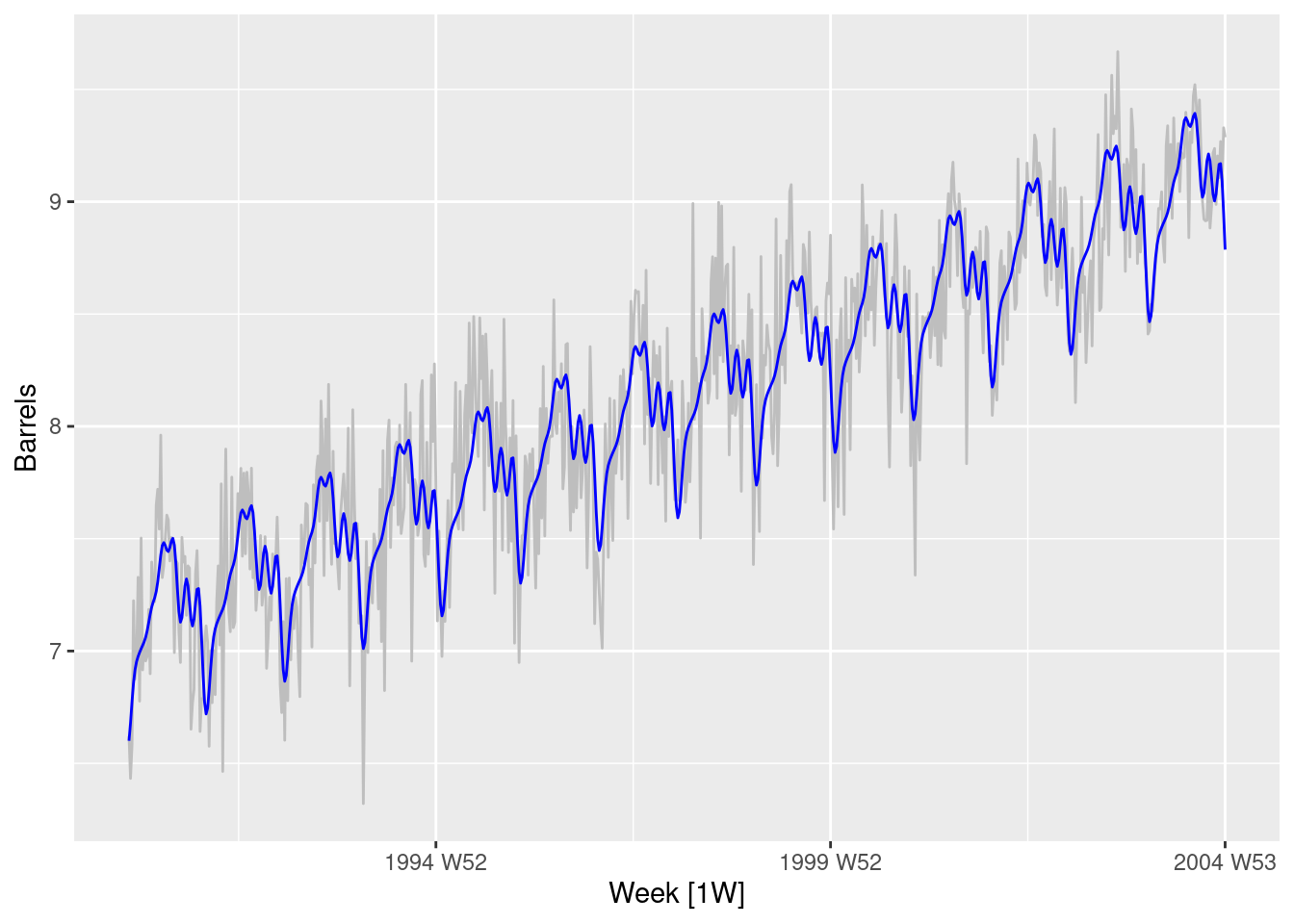
# Best model has order 7gas |>autoplot(Barrels, col ="gray") +geom_line(data =augment(fit) |>filter(.model =="fourier7"),aes(y = .fitted), col ="blue" )
This seems to have captured the annual seasonality quite well.
Select the appropriate number of Fourier terms to include by minimising the AICc or CV value.
As above.
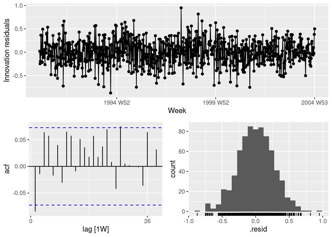
Check the residuals of the final model using the gg_tsresiduals() function. Use a Ljung-Box test to check for residual autocorrelation.
fit |>select(fourier7) |>gg_tsresiduals()
There is some small remaining autocorrelation at lag 1.
augment(fit) |>filter(.model =="fourier7") |>features(.innov, ljung_box, lag =52)
The Ljung-Box test is not significant. Even if the Ljung-Box test had given a significant result here, the correlations are very small, so it would not make much difference to the forecasts and prediction intervals.
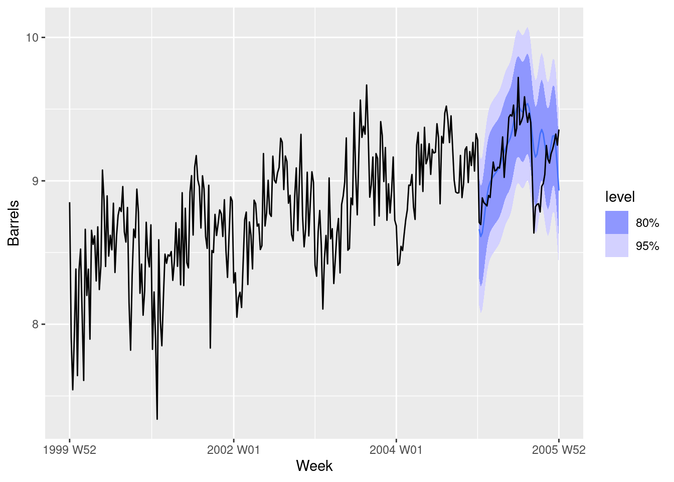
Generate forecasts for the next year of data. Plot these along with the actual data for 2005. Comment on the forecasts.
fit |>select("fourier7") |>forecast(h ="1 year") |>autoplot(filter_index(us_gasoline, "2000"~"2006"))
The forecasts fit pretty well for the first six months, but not so well after that.
fpp3 7.10, Ex 6
The annual population of Afghanistan is available in the global_economy data set.
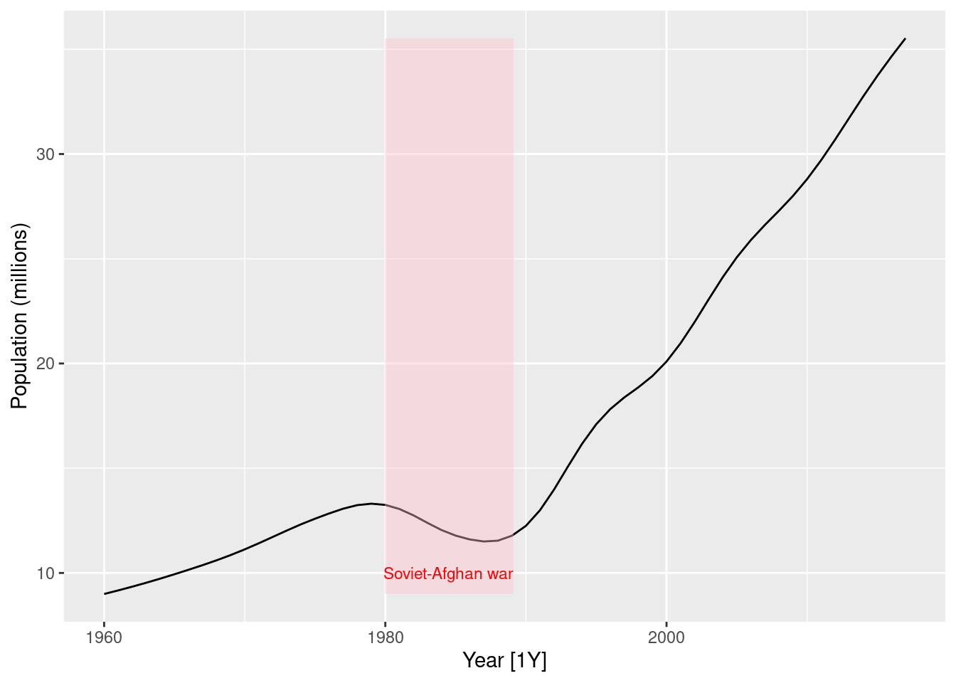
Plot the data and comment on its features. Can you observe the effect of the Soviet-Afghan war?
global_economy |>filter(Country =="Afghanistan") |>autoplot(Population /1e6) +labs(y ="Population (millions)") +geom_ribbon(aes(xmin =1979.98, xmax =1989.13), fill ="pink", alpha =0.4) +annotate("text", x =1984.5, y =10, label ="Soviet-Afghan war", col ="red", size =3)
The population increases slowly from 1960 to 1980, then decreases during the Soviet-Afghan war (24 Dec 1979 – 15 Feb 1989), and has increased relatively rapidly since then. The last 30 years has shown an almost linear increase in population.
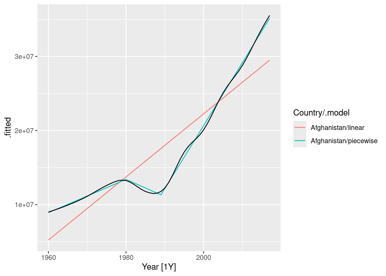
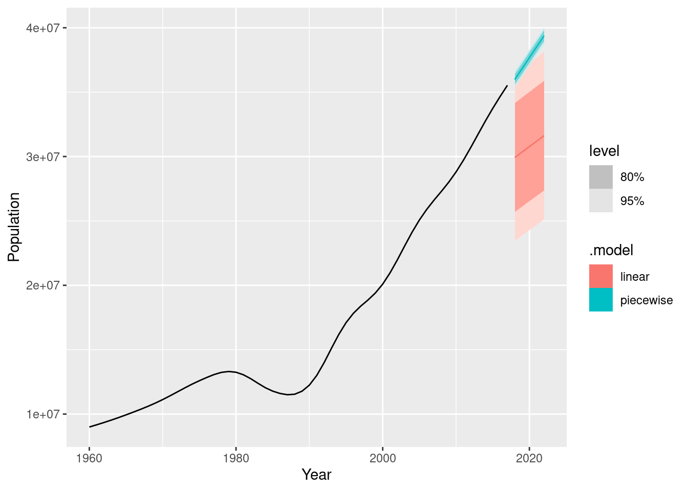
Fit a linear trend model and compare this to a piecewise linear trend model with knots at 1980 and 1989.
The fitted values show that the piecewise linear model has tracked the data very closely, while the linear model is inaccurate.
Generate forecasts from these two models for the five years after the end of the data, and comment on the results.
fc <- fit |>forecast(h ="5 years")autoplot(fc) +autolayer(filter(global_economy |>filter(Country =="Afghanistan")), Population)
The linear model is clearly incorrect with prediction intervals too wide, and the point forecasts too low.
The piecewise linear model looks good, but the prediction intervals are probably too narrow. This model assumes that the trend since the last knot will continue unchanged, which is unrealistic.
fpp3 7.10, Ex 7
Using matrix notation it was shown that if \mathbf{y}=\mathbf{X}\mathbf{\beta}+\mathbf{\varepsilon}, where \mathbf{e} has mean \mathbf{0} and variance matrix \sigma^2\mathbf{I}, the estimated coefficients are given by \hat{\mathbf{\beta}}=(\mathbf{X}'\mathbf{X})^{-1}\mathbf{X}'\mathbf{y} and a forecast is given by \hat{y}=\mathbf{x}^*\hat{\mathbf{\beta}}=\mathbf{x}^*(\mathbf{X}'\mathbf{X})^{-1}\mathbf{X}'\mathbf{y} where \mathbf{x}^* is a row vector containing the values of the regressors for the forecast (in the same format as \mathbf{X}), and the forecast variance is given by var(\hat{y})=\sigma^2 \left[1+\mathbf{x}^*(\mathbf{X}'\mathbf{X})^{-1}(\mathbf{x}^*)'\right].
Consider the simple time trend model where y_t = \beta_0 + \beta_1t. Using the following results,
\sum^{T}_{t=1}{t}=\frac{1}{2}T(T+1),\quad \sum^{T}_{t=1}{t^2}=\frac{1}{6}T(T+1)(2T+1)
derive the following expressions: